CASE STUDY
a mom-founded premium organic food company that envisions to feed natural, fresh and chemical free food to our children.

INTRODUCTION
About This Project
Early Foods is a mom-founded premium organic food company that envisions to feed natural, fresh and chemical free food to our children.
Get Started
Overview
When founder Shalini a new mom, struggled to find healthy food options for her own baby, she found her purpose: to re-introduce the traditional Indian foods for people. EarlyFoods is a very successful E-Commerce Store for buying healthy snacks for expecting mothers, breast-feeding mothers, infants and children who are beginning to develop their taste buds and also building their body.
Platform
The STORY
We kicked off the discussion by asking how we can get folks to check out more of our products and make their journey with us super easy and enjoyable. As we kept talking, we also wondered how we could build trust, especially for first-time visitors to our WebApp.
Think about Instagram—some people are a bit wary about buying stuff online because of bad experiences on other platforms. It gets even trickier when it's about health, especially for themselves and their kids. So, we need to figure out how to make them feel comfy and trust us right from the start.

📍 Preparation
DESIGN PROCESS
Design Flow
- Research & Ideation
- Design & Prototype
- Testing
Ideate
Turn idea from concept and brainstorm to MVP
Design
Sketch out the product to align the user needs
Develop
Convert the designs into a live application
Deploy
Launching the application to the market
Design Timeline
Our achievement in the journey depicted in numbers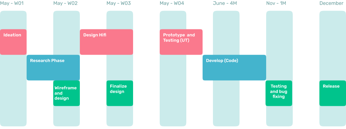
- Brainstorming
- Research
- Interview
- Interview
- Empathy Map
- Competitor analysis
- User journey
- General Flow
- Low Fi Testing (A/B)
- Brand identity
- Design Main Cases
- Design Edge Cases
- Design UI documentation
- Design System
- Design Flow Per Cases
- General Prototype
- Edge cases Prototype
- Usability Testing
- Gather Feedback
- Design Revision
- Handoff to developer
- Assets Documentation
- Translate from UI to code
- Unit Testing
- UI audit
- Gather Feedback
- Layout Revision after feedback
- Ready to test
- Testcase Creation
- Flow Creation from QA
- QA documentation
- UI Audit
- Revision to developer
- General Testing
- Release MVP
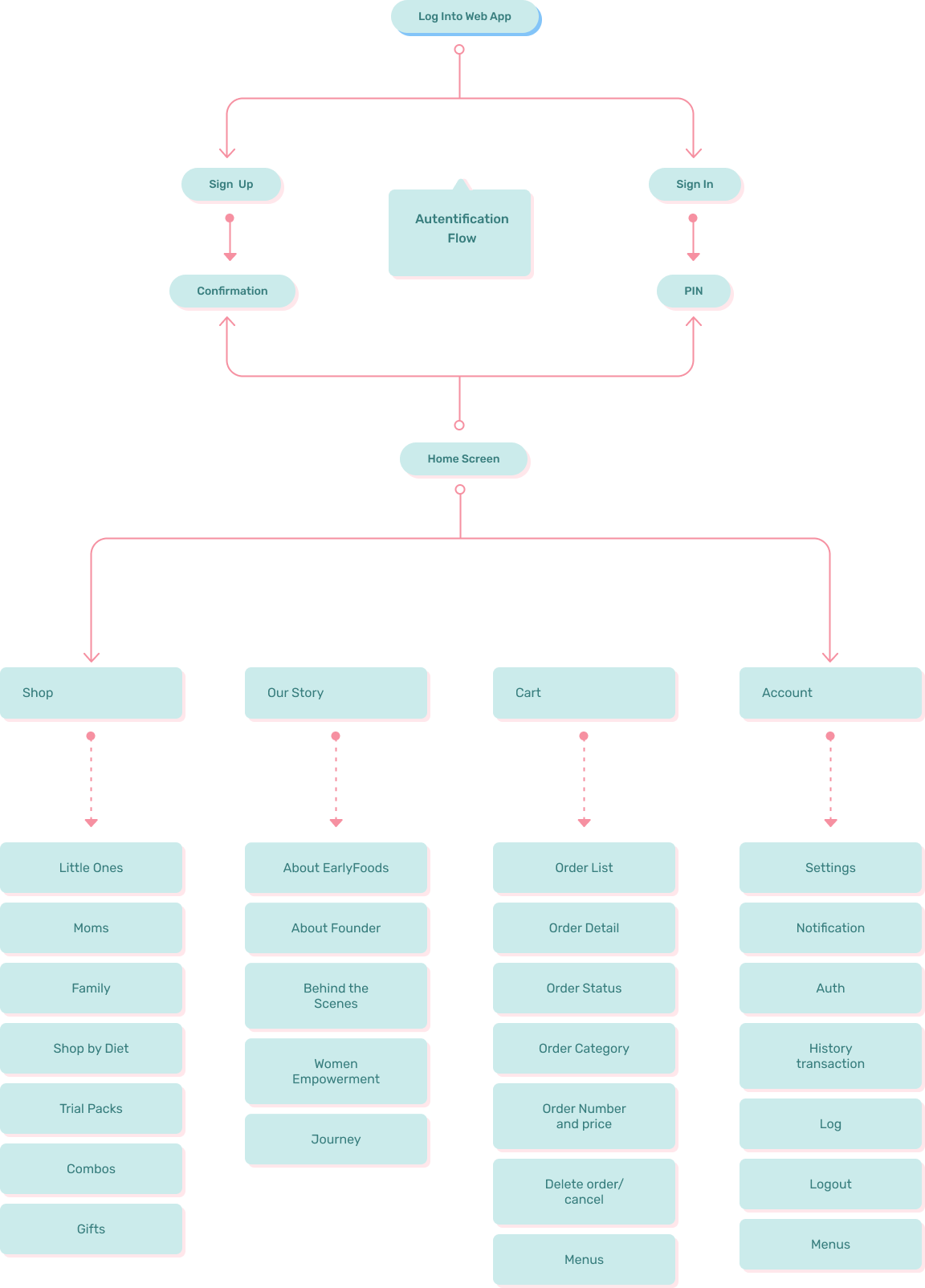
My Role
This process provided me with clear visibility to move the project forward, including creating backlogs, wireframes, branding, and ultimately designing the interface.
Research
This process is made so that the requirements and problems obtained meet the target market.
Flow Documentation
When the application is continued, it can be easily carried out.
UI Audit
Perform UI audits, make sure nothing goes wrong when the App is made.
Provide Assets
Ensure Assets contained in the UI are usable and provide in multiple sizes.
Prototyping
Creation of UI documentation so that developers can code well.
Branding
User testing using UT and AB testing, so that the App can be well received by the user.
📍 Preparation
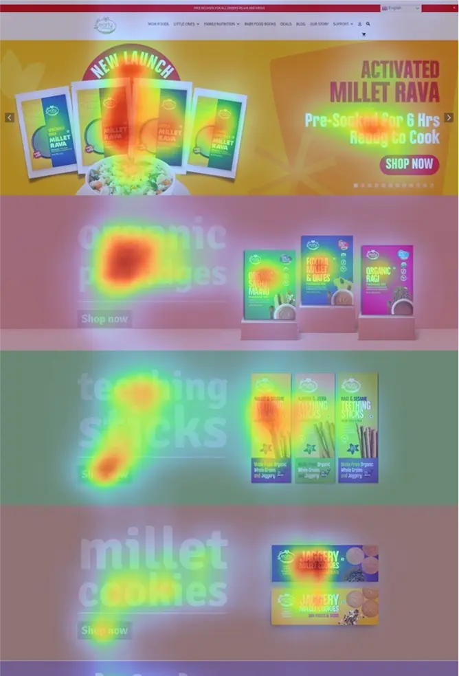
UX Audit
Design Flow
- Heat Map Testing
- Usability Testing
- Scenario Testing
📍 Preparation
USER RESEARCH
Research Plan
- Survey
- Interview
- Personas
- Empathy Map
- User Journey
User research is a process to find out the user point of view, their frustrations and their struggle to get their understanding. I have two used methods which contributed hugely in addition to my own findings
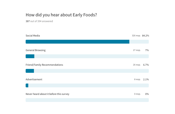
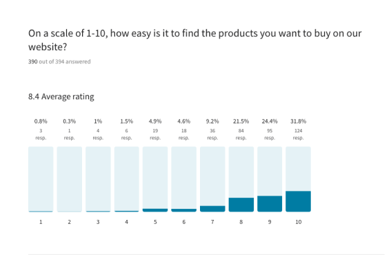
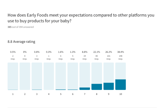
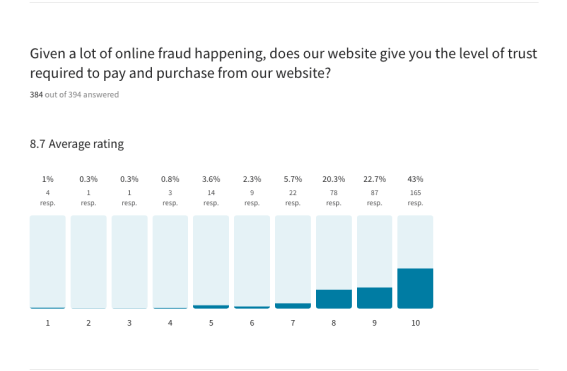
SURVEY
I did survey with 394 potential users in combination with interviews from individual conversation to know their views, experience and to collect quantitive and qualitative data. the target audience were between the age 21–50 Years old
INTERVIEW
From the survey that I have done, I did filtering, and got 2 people for direct interview. I did online interviews using Zoom and invited them at different times.
Neha Kumar
Mother
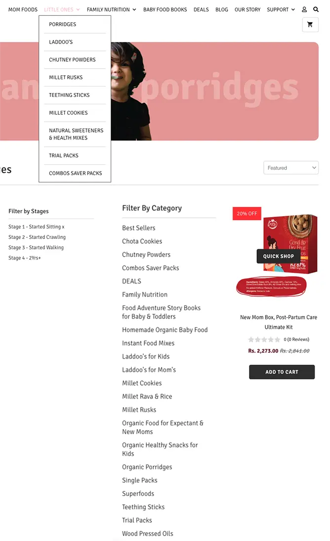
Can you please make the app for the phone . iPhone or android and make it user friendly and easy to purchase.No COD | Technical Difficulty
Hima Shah
Teacher
Couldn't find the Laddoos category easily, but rest all was good | Can't find products.. example Rusks.. I have to search
Ramya
Nutritionist
Product description or the way shown is not much user friendly
Ankita
Home Maker
No difficulty, sometimes if I search for an ingredient, not everything will show in the results
Tahera
Doctor
No information about product was given and no tracking id or any information is provided
Lik Emy
Food Seller
I cant able to find right products to my baby i didn't understood what to order of its month wise seperated its its easy to find
User Persona
It embodies the characteristics, goals, motivations, and behaviors of real users, serving as a reference point for design and decision-making processes in UX/UI development
Rachna Rajora
"Explorer"- Female
- Age: 32 Years
- Housewife
- Bangalore
Bio
Hi I am Rachana. I am from Neemuch but I live in Bangalore. My family was neither too open but mother has been always supportive and because of her I have achieved a lot of things in my life. I have done graduation and a diploma in hospitality. I have learned a lot from my career as I used to keep changing my jobs. I started my own business as well in Gurgaon. My business was my achievement I was so proud of and now being a mother is my another achievement as I love this phase of my life. I have a small and beautiful family of a baby boy, my dog, and my husband. I love doing DIY projects, painting, and traveling. Thanks
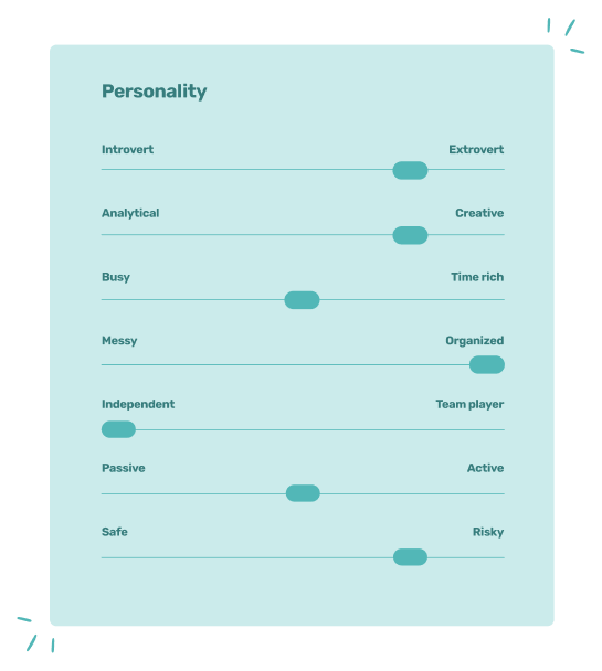
Interests
- Sugar Free Products
- Post Partum Products
- Laddoos
Influences
- Mom-Centered Business
- Transparent Ingredients
- Ayurveda Inspired
Needs and expectations
- Focus on Child Growth
- Healthy Snacks
- Trial packs for all variants
Goals
- Freshly Made Products
- Healthy Snacks
- Trustable Platform
Motivations
- 100% Clean
- Women Empowerment
- Wish there were noodles/snacks
Pain points and frustrations
- Sugar in everything
- Artificial Colors
- Hidden ingredients
Empathy Map
An empathy map is a collaborative visualization used to articulate what we know about a particular type of user. It helps to synthesize research data to bit assist to understand how people make decisions.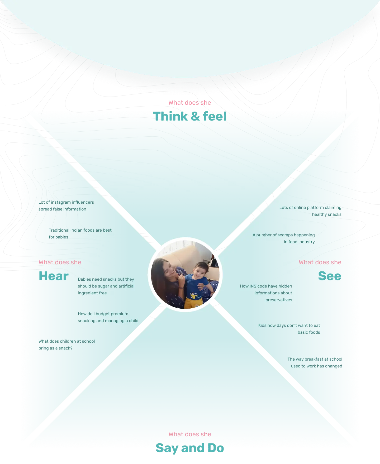
Gain
- •Enhanced Accessibility of Help and Support
- •Favourites and Wish List Feature
- •Simplified Sign-Up/Sign-In Process
- •Comprehensive and Sequential Product Imagery
- •Estimated Delivery Time
Pain
- •Irrelevant Filter Options
- •Misplaced Content in Product Information
- •Inclusion of Product-Based FAQs
- •Product Texture Details
- •Age Group Specifications
 Define
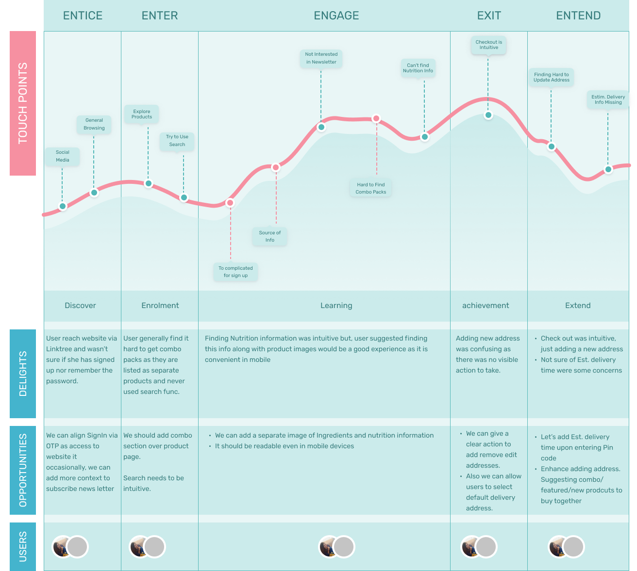
USER JOURNEY MAP
Point take away
- • Entice
- • Enter
- • Engage
- • Exit
- • Extend

📍Define
Extensive Research
Research Plan
- • Methodology
- • Competitor Research
- • Extensive Survey
- • Behaviour Psychology
- • Gaps & Fixes
- • Backlogs
Introduction
This research uses the Stimulus-Organism-Response (S-O-R) paradigm to understand online consumer behaviour, particularly in the context of baby foods e-Stores, with the intention to explore the effect of perceived value as a mediator.
Stimulus in this context is the Baby Food E-Store image for ages 0-3. The research uses four dimensions of the image: e-store design, order fulfilment, communication services, and security and confidentiality. These parameters are chosen to reflect consumers' perception of the online store's functionality.
The organism in this context is the Perceived Value, seen as a comparison of the benefits received versus the cost paid during the buying process. This extends beyond simply the income-cost comparison, it also incorporates consumers' expectations and feelings towards a specific product or service. The research adopts Hallem and Barth's division of consumers' perceived value into emotional and functional values.
Response refers to consumers' purchase intention, which will be measured against the baby food e-store image and the perceived value derived from it. The S-O-R model aims to provide insights into what features can genuinely capture consumers' intentions, satisfy their needs, and increase their online consumer behaviours, particularly in the continuously evolving online market.
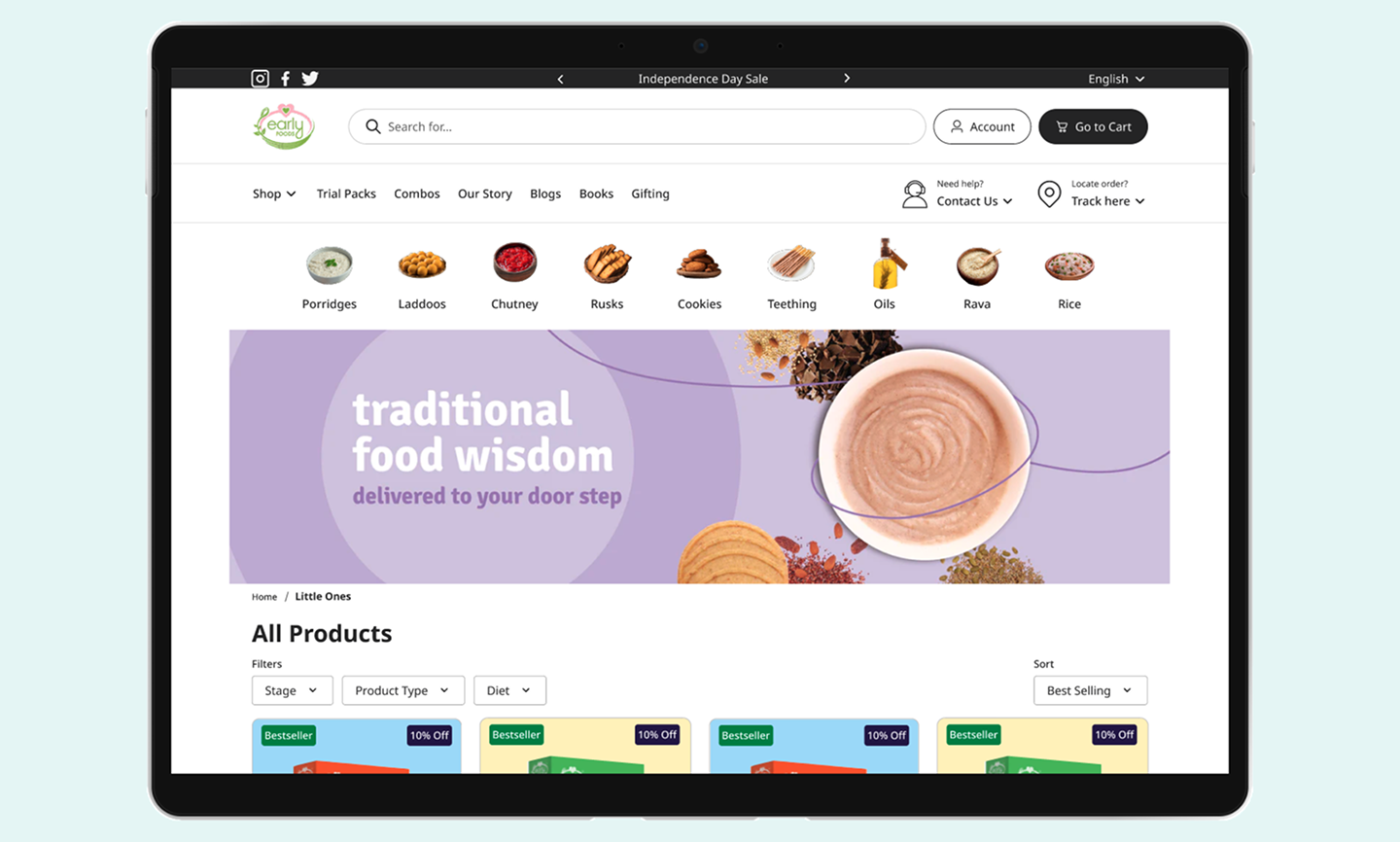
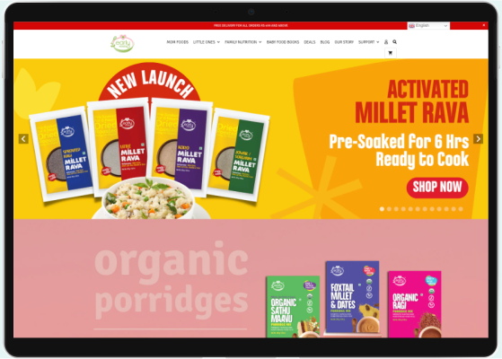
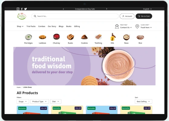
Baby Food E-Store Image
E-Store Design


This research focuses on the impact of different aspects of e-commerce platforms on the perceived value of the customer and their subsequent purchase intention. The hypotheses can be summarized as follows:
E-store Design:
The design of an online shop, including elements like page layout, art design, search functions, and convenience, significantly affects the customers' perceived emotional and functional value. Poorly designed stores can lead to customer rejection.
Order Fulfillment:
The consistency of an e-commerce platform in fulfilling its promises to customers impacts the perceived functional and emotional value. Inconsistencies can lead to a decrease in perceived value and customer trust.
Communication Service:
The quality of the customer service, including timely and professional responses, affects the perceived emotional and functional value. Frequent communication and exchanges between buyers and sellers can increase trust and, therefore, perceived value.
Security:
The image of security and confidentiality is crucial for easy and safe online shopping. Concerns about personal data leaks, unsafe payment methods, and unclear commissions can impact the perceived emotional and functional value.
Perceived Value and Purchase Intention:
A positive perceived value, both emotional and functional, can significantly drive consumers' purchasing behavior. Higher perceived benefits compared to costs result in stronger purchase intention.
Mediating Effect of Perceived Value:
The image of the online store can impact customers' perceived value, which in turn influences their purchase intentions. Both emotional and functional value play a mediating role between the online store image and customer purchase intentions.
In the context of a baby food online store, these hypotheses suggest that factors like design, order fulfillment, communication service, and security strongly influence the customer's overall experience and their decision to make a purchase.
Competitor Analysis
To evaluate the features, usability, and user experience of competitors' products or services. This analysis helps identify strengths, weaknesses, opportunities, and threats in the market, enabling designers and companies to uncover gaps, differentiate their offerings, and enhance user satisfaction.
.svg)
Manna Foods
Unique value proposition
Manna Foods is offering healthy, organic, and GMO-free baby food products.
Advantages
The advantages include its continued focus on producing natural, organic products as well as its established reputation in the industry.
Disadvantages
The disadvantage includes the relatively high cost of its products.
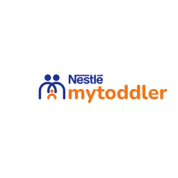
My Toddler
Unique value proposition
My Toddler, the unique value proposition is providing affordable and convenient baby food and meal options.
Advantages
The advantages include its competitive pricing and easy-to-access platform, as well as its selection of healthy food items.
Disadvantages
The disadvantage includes its limited range of product offerings.
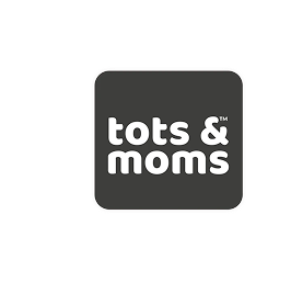
Tots and Moms
Unique value proposition
Tots and Moms, the unique value proposition is highlighting health and nutrition in its product offerings.
Advantages
The advantages include its focus on healthy and natural ingredients, as well as its commitment to customer satisfaction.
Disadvantages
The disadvantage includes its lack of a direct to consumer e-commerce platform.
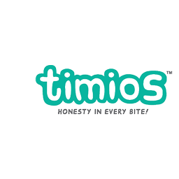
My Timios
Unique value proposition
The unique value proposition is providing a personalized shopping cart based on a customer's individual needs.
Advantages
The advantages include its personalized shopping experience and its range of organic, whole food options.
Disadvantages
The disadvantage includes the high price of its products.
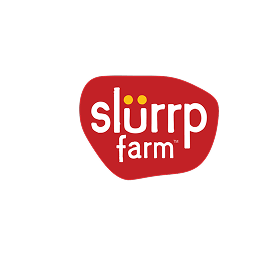
Slurrp Farm
Unique value proposition
Slurp Farm offers organic, preservative-free, and healthy food products for children, focusing on the provision of essential nutrients.
Advantages
Transparent Branding: Their focus on transparency about their ingredients builds trust with customers.
Disadvantages
Perception of Taste: While Slurp Farm works hard to make their products tasty, some children (or their parents) may prefer the taste of less healthy, but more traditionally flavorful options.
Market Research
Market research involves gathering, analyzing, and interpreting information about a market, including a product's or service's nature, characteristics, and potential customer base.
These findings indicate that there is a strong market for organic and healthier pre-prepared and ready-to-eat meals and snacks among parents and new mothers. It is likely that such a product would be successful in the market if it is backed by trusted sources, offers convenience and reduces stress (such as reductions in cost), and offers
The Problems
After the extensive research, surveys, and interviews I was able to find out these problems in the current user experience and visual elements, below mentioned are only the high priority problems.
The Solutions
Based on the problems we found out below are the solutions that we proposed client in order to enhance the overall User experience and enhance the joy of shopping from the Early Foods.
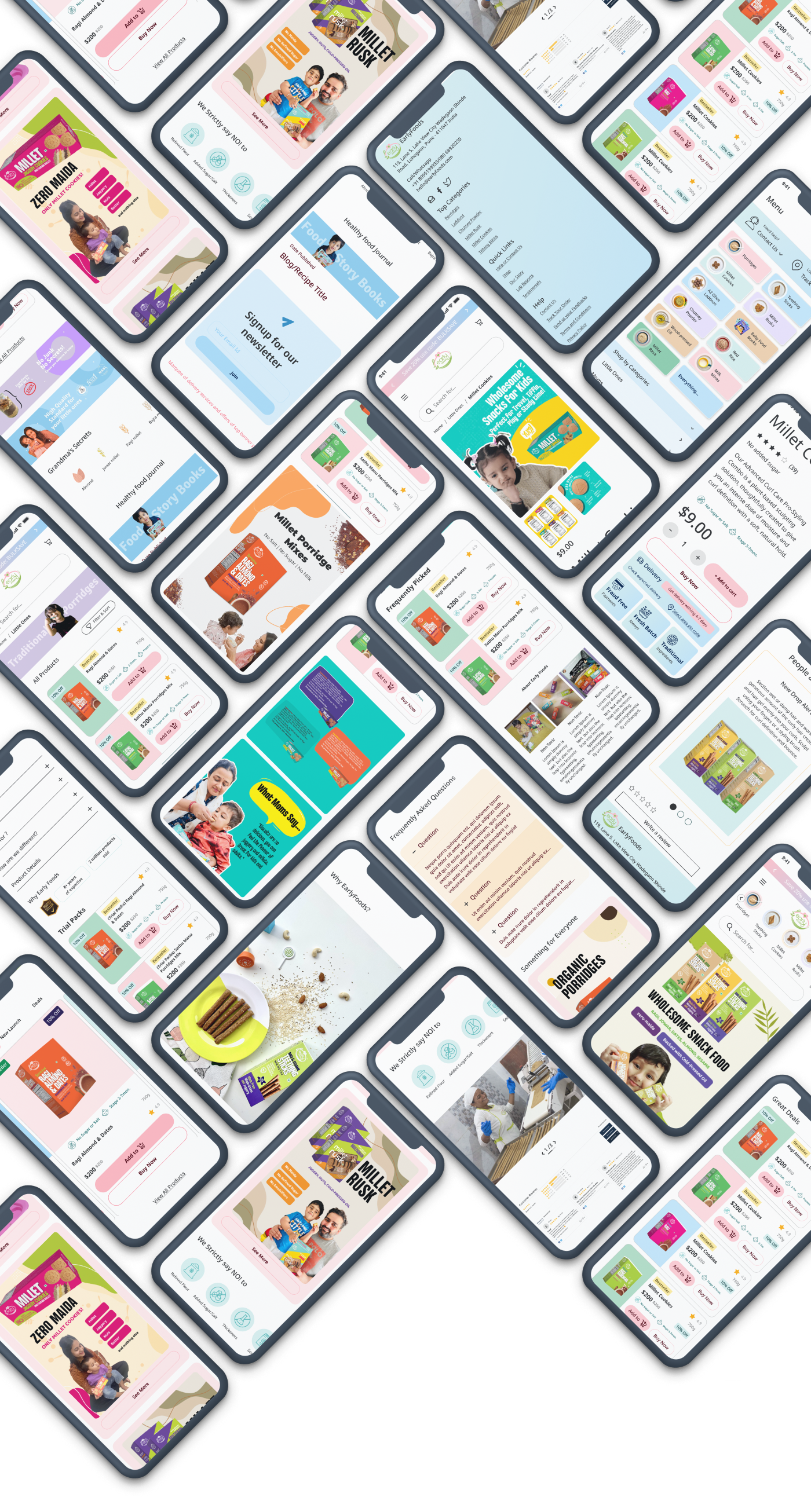
📍UI Design
Visual Design
Point take away
- • UI Screens


Before
📍 UI Design
Style Guide
Point take away
• Typography
• Color
• Iconography
COLOR STYLE GUIDE
Primary - Main
Colors that represent EarlyFood brand, used as primary color.
Main 01 (EF Light Pink)
#FFB6C1 | EF-Light Pink/06-base
Main 02 (EF Sky Blue)
#87CEFA | EF-Sky Blue/06-base
Main 03 (EF Green)
#B4E2E2 | EF-Green/06-base
Primary - Supplementary
Colors that complement the use of primary colors.
Supplementary 01 (Lavender Blue)
#D5C7FF | Lavender Blue/06-base
Supplementary 02 (Yellow)
#FFEEA2 | Yellow/06-base
Supplementary 03 (Caramel)
#FFD9A0 | Caramel/06-base
📍 Typography
Primary Typeface
Fredoka One
01 LOWER CASE | 02 REGULAR
k l m n o p q r s
t u v w x y z
Primary Typeface
Noto Sans
01 REGULAR | 02 SEMI BOLD | 03 BOLD
k l m n o p q r s
t u v w x y z
📍 ICONOGRAPHY
Information Architecture
People often use the word “Information Architecture” to mean the menus on website or apps, but thats not really correct. while menus are a part of IA. they’re really only one part of it. Information architecture is all about organisation of information in a clear and logical way. such organisation follows a clear purpose helping users navigate complex sets of information
UI Design
Every components layout structures, and color combinations are backed by strong human psychology of perceiving experiences quoted by sir Don Norman in the book - The design of everyday Things.